Pueria
Peace and support

PROJECT
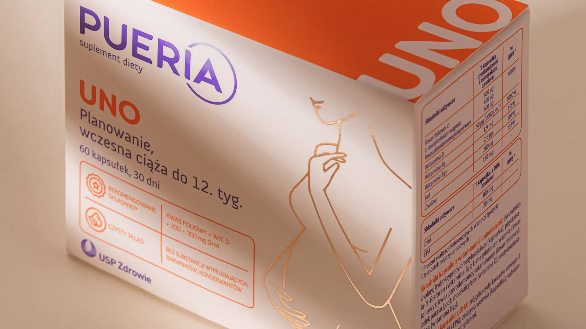
During pregnancy, women have to take care of their own health and that of their unborn child at the same time. That is why they want to choose preparations that give them confidence that they do it well. One of these supplements is Pueria. Both in terms of formulation and design.
USP Zdrowie commissioned us to consult and correct the prepared design. The goal was to create a visual identity that stands out through peace and elegance; that fits into categorical codes; that has a clear information architecture; that explains in an understandable way that the capsules contain ingredients recommended by the Polish Society of Gynaecologists and Obstetricians.

IMPLEMENTATION AND RESULTS
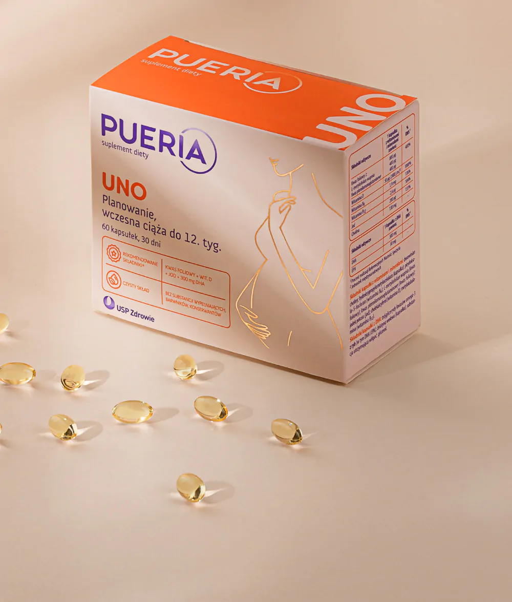
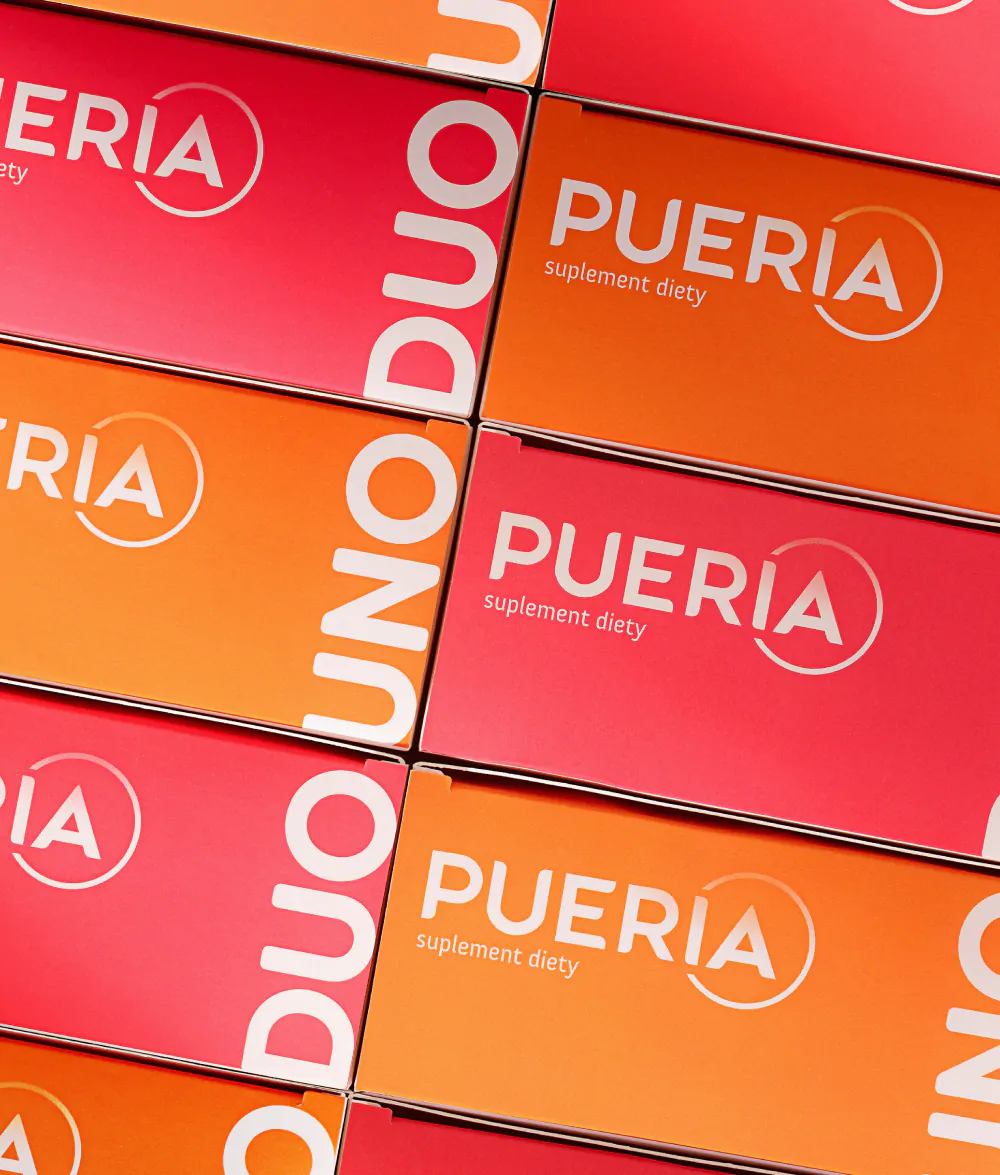
We went through the whole process – from organising the design to introducing elements that will distinguish Pueria on the shelf. We specified the brand colours. We introduced a clear division into two lines: early pregnancy and pregnancy with breastfeeding. We designed clear icons and tables. Finally, we covered the packaging with foil that aesthetically reflects light. Thanks to this, the brand stands out from the competition on the shelf. This was confirmed by our visibility test.
As a result, the client received an improved packaging design that corresponds to the design assumptions and stands out on the market. As for consumers, they gained a preparation with a pure composition, perfectly supporting their health during pregnancy.
