


Unifying two accounting firms, one in the UK and one in Poland, under a cohesive brand and a shared vision for growth.
Dauman & Co and Capital Business Links, despite shared ownership, lacked a unified brand identity. Both firms approached us to create new branding, but our analysis revealed a deeper challenge: differing internal perspectives on the business and its future, compounded by customer confusion about the firm’s core services. The priority became crafting a clear, credible brand strategy that bridged these gaps.
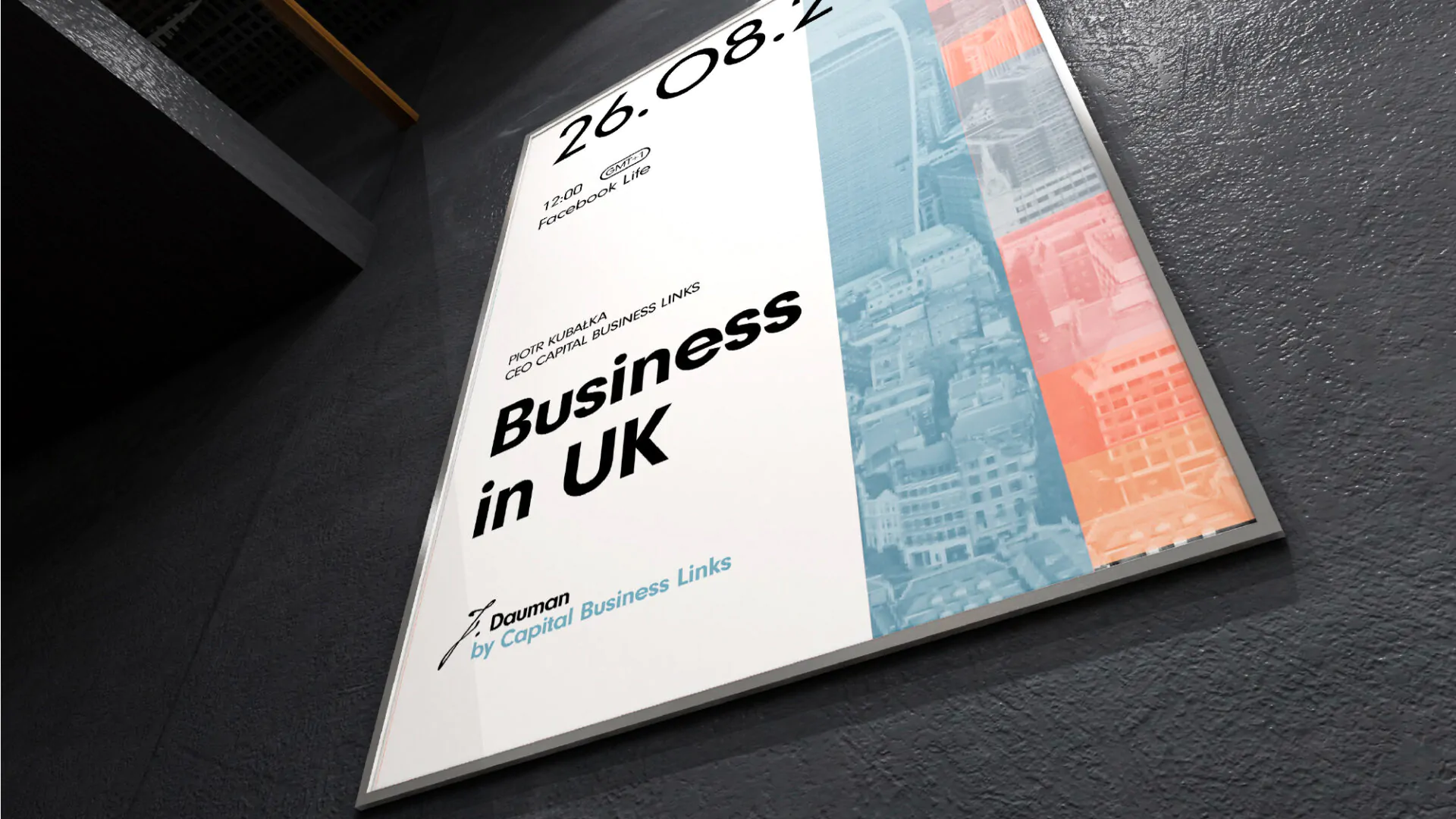
We defined J.Dauman’s mission, vision, and objectives, focusing on its role as a partner for Polish entrepreneurs expanding internationally. J.Dauman emerged as a guide, translator, and strategist, helping businesses navigate foreign markets and “speak” the language of finance.
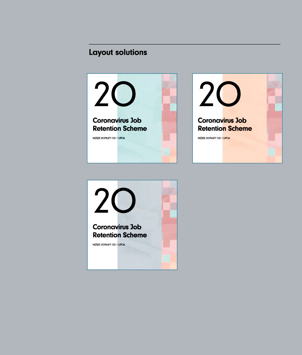
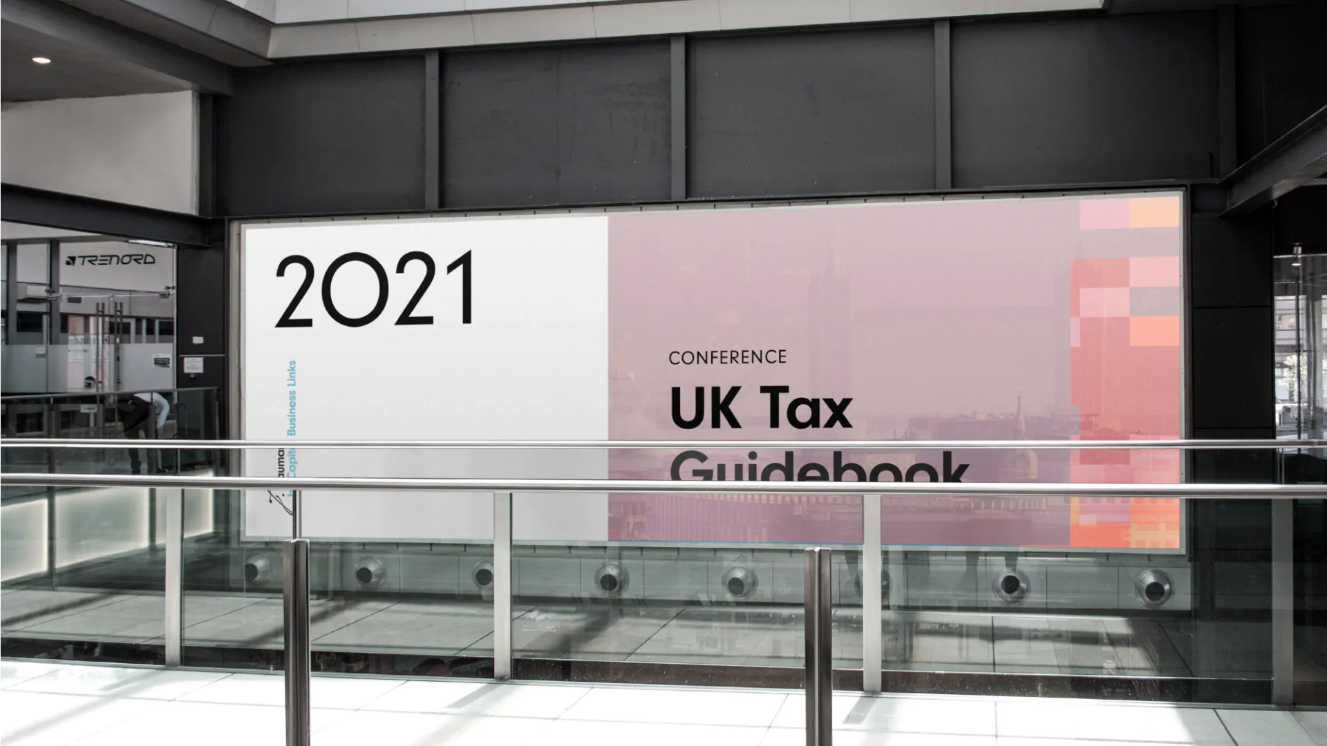
The visual identity leaned into the universal symbol of finance: the banknote. We developed a design system with clean, structured layouts and a subtle yet sophisticated color palette, incorporating elements inspired by watermarks. We also spotlighted the story of Jerzy Dauman, the firm’s founder, who emigrated from Poland in 1948 to establish the business in the UK. His legacy of helping post-war Polish immigrants adapt became a metaphor for the firm’s current mission – supporting modern entrepreneurs entering new markets. His handwritten signature now forms the foundation of the logo, emphasizing a personal, human-centric approach that differentiates the brand in a numbers-driven industry.
J.Dauman emerged as a strong, heritage-rich financial brand, now serving as the unifying identity for the entire organization. This strategic shift enabled the firm to attract partners previously out of reach, enhancing both credibility and market presence.


Paweł Bulaszewski
Analyst
At One Eleven, Paweł handles sales data analysis and elements of broadly defined desk research: competitive analysis, communication, positioning, and benchmarks.
He has been working at O11E since its inception, that is for over 10 years. Previously, as a freelancer, he worked in various fields of marketing.
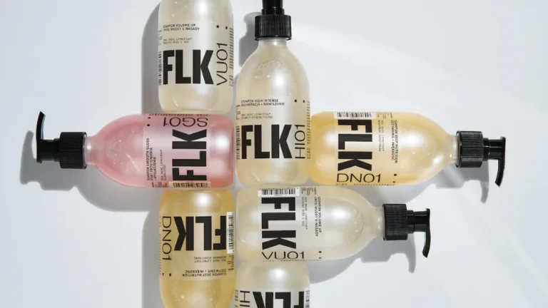
Paweł considers his most important project to be a multi-categorical exploration of global trends in supplementation and wellness solutions for women, culminating in the recommendation of clear conceptual directions for new brands.
He likes American music and doesn’t like latecomers.
Rafał Hydzik
Diagnostics Specialist
At One Eleven, research is his expertise – he approaches market and consumer analysis with passion, using a variety of research methods and examining data from every possible angle. Every new piece of knowledge is a key to success. Before joining One Eleven, he gained experience at renowned companies like IQS and collaborated with leading industry experts. In 2020, with support from the Wrocław Culture Zone, he conducted an in-depth study on the impact of the pandemic on the cultural sector in Wrocław. While his past projects have had a significant impact on the industry, the greatest challenges and successes are still ahead of him.
Fascinated by semiotics and culture, he continuously seeks new inspirations. As a researcher, he is constantly exploring topics that intrigue him, sharing his insights at prestigious conferences like INSUMMIT.
In his personal life, he dedicates himself to creative hobbies, particularly working with wood and building LEGO structures. Raised in London and passionate about football, he is actively looking for ways to combine his love for the sport with his professional research work.
Paweł Jasiński
Strategist
At One Eleven, he focuses on developing brand strategies and positioning, translating them into practical tools and plans. He started in the brand consulting department at BNA/. He worked as a strategist at MullenLowe, 2012 Agency, VML, and Przestrzeń. He co-founded the branding agency Wyraz and served as the Strategy Group Head at VMLY&R. He is also the co-founder of NEW AREAS.
He enjoys everything new and challenging. Learns fast. Dislikes excessive content and ugly slides.
He is interested in emerging phenomena in rap music, broadly defined design, and technology. He is passionate about tools that enhance human capabilities, especially those in closed beta phase. He’s the biggest boxing enthusiast he’s ever met.
Szymon Golis
Motion designer
Szymon is a motion designer specializing in creating engaging projects based on rhythm, typography, and storytelling. In his work, he dynamically applies principles of motion, with a particular focus on easing, to craft smooth and natural animations. His portfolio includes kinetic typography, user interfaces, and brand visual identities.
Szymon strives to ensure his designs not only catch the eye but also simplify complex content, aligning with natural motion patterns to keep viewers consistently engaged.
At o11e, he supports creative initiatives by blending aesthetics with functionality and helping teams translate ideas into clear, visual communication. Outside of work, he’s passionate about sports—especially tennis and football—and enjoys exploring the world of music.
Anna Andrzejewska
Strategist
At One Eleven, Anna develops brand strategies (including brand positioning), portfolio strategies and comes up with concepts for new brands.
Previously, she worked at Synovate (now Ipsos), a research agency, where she was responsible for conducting qualitative research with random-sampling projects for local and international clients. She also worked at DDB and VMLY&R advertising agencies, where she was responsible for developing brand communication strategies, as well as at Deloitte as a brand consultant.
Anna considers the co-creation of communication platforms for T-Mobile and PZU brands to be her most important projects.
In her spare time, she likes to play tennis and snowboarding. She doesn’t like Brussels sprouts.
Agata Groszek
Diagnostics Specialist
At One Eleven, she designs research projects, oversees their execution, and prepares insights for the strategy department.
A sociologist by education and passion, she took her first steps in research at Ipsos, conducting quantitative studies for clients such as Perrigo and Teva. She deepened her expertise in research and media while working at Havas, managing projects for Hasco Lek, CD Projekt Red, and British American Tobacco. She has experience in concept testing, conjoint analysis, and U&A studies.
She considers her most important project to be the one whose findings she had the opportunity to present at the first edition of the Insummit festival—an in-depth study of TikTok discourses on femininity and their relationship with offline, traditional models of being a woman.
In her free time, she enjoys reading reportage (especially about the U.S.), baking sourdough bread, and watching TV series. A devoted dog mom and a pilates enthusiast.
Arkadiusz Trela
Associate, business and innovations, retail expert
Arek collaborates with One Eleven on projects related to retail and requiring complex marketing and business knowledge. He helps us with business modeling as well as evaluating the feasibility and profitability of developed concepts.
Arek is an extremely experienced specialist in the field of business strategy and development, with over 20 years of experience in both B2B and B2C markets in Poland and abroad. He currently focuses mainly on strategic consulting and commercial advisory.
He gained his professional experience as a Partner at Tequila Aguila Superior and TradeBridge Poland, and as a Business Development Director at eFaktor S.A. He also worked as a Country Manager at Philip Morris in Latvia and at Bacardi-Martini Polska as first a Marketing Director and then a Managing Director. Previously, he held various positions in sales, marketing, and management at companies such as Coca-Cola CBO Cracow, Master Food Polska, and US West Polska.
His greatest achievements include a six-fold increase in volume with increased business profitability at Bacardi-Martini Polska, and a radical change in the business model of Philip Morris in Latvia, which contributed to the long-term growth of all key business indicators after years of decline.
He is interested in diversity management and multicultural management. Privately, he is passionate about traveling. He does not like stagnation and the “it can’t be done” approach.
Joanna Warchulska
Finances
At One Eleven, Joanna is responsible for financial supervision, planning, monitoring the effectiveness of projects and administration.
She graduated from Sciences Po and College des Ingénieurs in Paris and has been working in finances for over 20 years. Joanna gained her experiences in finances both in large corporations and marketing agencies. Holder of the Chartered Global Management Accountant designation.
She likes musicals and rainy days.
Paweł Bulaszewski
Analyst
At One Eleven, Paweł handles sales data analysis and elements of broadly defined desk research: competitive analysis, communication, positioning, and benchmarks.
He has been working at O11E since its inception, that is for over 10 years. Previously, as a freelancer, he worked in various fields of marketing.
Paweł considers his most important project to be a multi-categorical exploration of global trends in supplementation and wellness solutions for women, culminating in the recommendation of clear conceptual directions for new brands.
He likes American music and doesn’t like latecomers.
Zuzanna Kolmus
Diagnostics Specialist
At One Eleven, Zuzanna analyses market processes and consumer behaviour, as well as searches for insights to facilitate sensible business decisions.
Previously, she worked as a quantitative and qualitative market researcher at KANTAR Polska. She was a member of a team that dealt with the assessment of innovation potential and NPD processes and also a member of the KANTAR Youth Board advisory unit the company’s strategic and advisory panel. She received the KANTAR G.O.L.D. award in the Open Mind 2017 category.
Zuzanna considers her most important projects to be the “Ziemianie atakują? (Attack of the Earthlings) initiative, the aim of which was to measure the level of awareness and openness of Poles to eco-consciousness. She also worked on the development of leading FMCG brands such as Stock, British American Tobacco and Herbapol.
In her spare time, she likes to watch ?90s films and meeting people offline, the pre-pandemic way. She doesn’t like ,,overintentions”, ,,overinterpretation” and cashews.
Marta Kurek
Project Manager
At One Eleven, she is responsible for managing key projects and building strong client relationships. She oversees their execution, ensuring timeliness and budget control.
With nearly a decade of experience in the advertising industry, she has worked with agencies such as Assembly Digital Commerce, K2, and Cut The Mustard, specializing in project management and business relations. She has led complex digital projects for global brands like 3M, Coty, and Wella, as well as developed communication strategies and creative platforms for companies in the FMCG, Pharma, Beauty, and Home Furnishing sectors.
One of her key achievements includes co-creating the digital strategy and implementing the first phase of IKEA’s e-commerce launch in Poland. She also has extensive experience in overseeing content production for brands such as Max Factor, AA Laab, 3M, and BAT.
A film and series enthusiast, but nothing compares to the sight of the sun setting over the ocean.
Andrzej Olkowicz
Project Manager
At One Eleven, Andrzej runs projects and maintains relationships with the company’s key accounts. He also oversees the project management team.
Previously, he worked at the Marketing Communication Association SAR. For five years he was responsible for all activities related to the Effie Awards’ competition and gala including liaising with sponsors, jurors, and the Organising Committee. Previously, he was involved in the organisation and coordination of corporate events for such companies such as Microsoft, Mercedes Benz Polska, Imperial Tobacco and Volkswagen Bank.
Andrzej considers the creation of the MBS by Effie programme, of which he was the originator and co-creator, to be his most important project. He took an active part in the whole process of its development from ideation to implementation.
In his spare time, he likes keeping up with new technologies and playing computer games, and doesn’t like boredom nor repetition.
Piotr Pędzich
Design o11e+edgar
Graduate of Communication Design at the School of Form, SWPS University. Professionally (and as a hobby) a graphic designer and photographer. Possesses a broad range of skills related to visual communication, from analog screen printing to modern interface design. Enjoys and documents 20th-century architecture. Dislikes the “diseases” that afflict cities.
Piotr Gąsienica-Daniel
Strategy Director
At One Eleven, Piotr manages the strategy department and is responsible for coordinating complex conceptual designs.
Previously, he worked on the client’s side as Chief Marketing Strategy and Research Specialist at PZU and at TNS, an international research company (currently known as Kantar). He has carried out several dozen strategic and research projects for entities in the FMCG, financial, technology and service industries.
Piotr considers his most important projects to be: co-creating the PZU Group’s portfolio and branding strategy after the acquisition of Baltic markets? entities (Lithuania, Latvia, Estonia) and comprehensive strategic services for the USP Group’s portfolio of brands and innovations.
In his spare time, he likes to hike and play tennis. He doesn’t like the music of Polish Highlanders and squash.
Zuzanna Gałuszka
Strategist
At One Eleven, she executes projects related to brand strategy, communication, and portfolio. She ensures that strategic assumptions translate into design, actively participating in creative processes alongside designers and copywriters.
She holds a PhD in Social Sciences, with research interests consistently focused on the discursive construction of social reality. For years, she has been affiliated with the Faculty of Social Communication and Media at the University of Wrocław, where she taught courses in the branding specialization.
Previously, she gained experience at the branding agency Connect The Dots, where she was responsible for developing concepts and building the comprehensive image of local brands.
She particularly values projects that require a deep understanding of culture, as well as those for brands in highly commoditized categories. She has worked for FMCG leaders such as WW, Pudliszki, Heinz, Tymbark, Perła, as well as for fashion, pharmaceutical, media, and entertainment brands.
Privately, she has a soft spot for vintage items and the seaside.
Tomasz Bartnik
Partner, strategy
Founder of One Eleven. Tomasz is responsible for the vision for the company’s development and participates in the processes of building strategies and developing innovations.
Previously, he was Vice President and Chief Strategic Officer at Saatchi & Saatchi Group in Poland and participated in the endeavours of an international team that supervised EMEA strategy departments. Previously, he was also a Partner at Corporate Profiles Consulting. Tomasz co-created and managed teams in strategic agencies and strategy departments of advertising agencies. In total, he has been immersed in strategy for over twenty years and has wide experience in working with various product categories, brands, and challenges. He is also a multiple laureate and juror of Effie, and for the past three years has been a member of its Organising Committee. Tomek is a social projects contributor at the Polish Business Roundtable, member of the SAR Educational Board and the SSM SAR Programme. He gives lectures at MBS by Effie and SSM SAR.
He considers progressiveness and open-mindedness as his fortes, as well as the ability to adapt quickly to circumstances, change methods or execute a radical conceptual pivot. According to Tomek the only constant in his work is change.
He likes strong wind and big waves, not walks.
Krzysztof Goryński
Member of the Board of One Eleven and Director of Diagnostics
At One Eleven, Krzysztof is responsible for the company’s development in market analysis and consumer research.
Previously, he worked at TNS, GFK and Gemius, top research companies in Poland, holding positions ranging from project manager to team leader. As a research manager at nc+ he carried out, among other things, research in the merger process between Cyfra+ and Platform N. Later, as a research and strategy manager, he managed the research area in the process of the player.pl brand transformation as well as research of TVN’s marketing strategy. Since 2018, he has been a lecturer at the School of Brand Strategy SAR. From time to time he cooperates with universities, giving classes on consumer research and analysis and also new media.
Krzysztof considers the following to be his most important projects: consumer segmentation for the Play, Netia, CANAL+ and player brands; brand and communication tracking in companies: player, TVN; research projects within the process of BPH’s re-branding and the diagnostic process for the Big Milk brand strategy.
He likes passion and commitment to projects, as well as relations based on partnership and equality at work and in business. He doesn?t like chaos in processes, conceit, and hierarchy in interpersonal relationships.
Joanna Witek-Lipka
Design o11e+Edgar
At o11e, he is in charge of leading visual identity projects for brands.
Trained as a lawyer, she has been involved in cultural management and production of art events and artbranding and branding projects since 2012.
She has worked with partners such as Hermes, META, Campari, Suzuki, PKO S.A., VRG, ING, Puro, Raffles European, White & Case, NYX and Hestia’s Artistic Journey. She has been with Edgar Bak Studio since 2014, executive producer since 2019 and director of Warsaw Gallery Weekend since 2020.
She enjoys reading, writing and being on the move. She doesn’t like to be hungry.
Edgar Bąk
design o11e+edgar
He designs visual identities, signs, packaging and spaces. Involved in social projects, he is the author of children’s books published in Poland and abroad that address issues of equality.
He has conducted workshops in Japan, Israel, Estonia and Italy and taught a course in visual identity design at the School of Form. With Charlotte West, he prepared “Project: the Polish Journal of Visual Art and Design,” for Unit Editions. Repeatedly awarded: KTR, Łódź Design Festival, STGU and Book of the Year. Major projects: kilims “Chaos” and “Cosmos” for Splot Kilim, visual identity for Nowy Teatr and OKO.press.
Likes the lake, doesn’t like driving.